Dashboard Sidebar
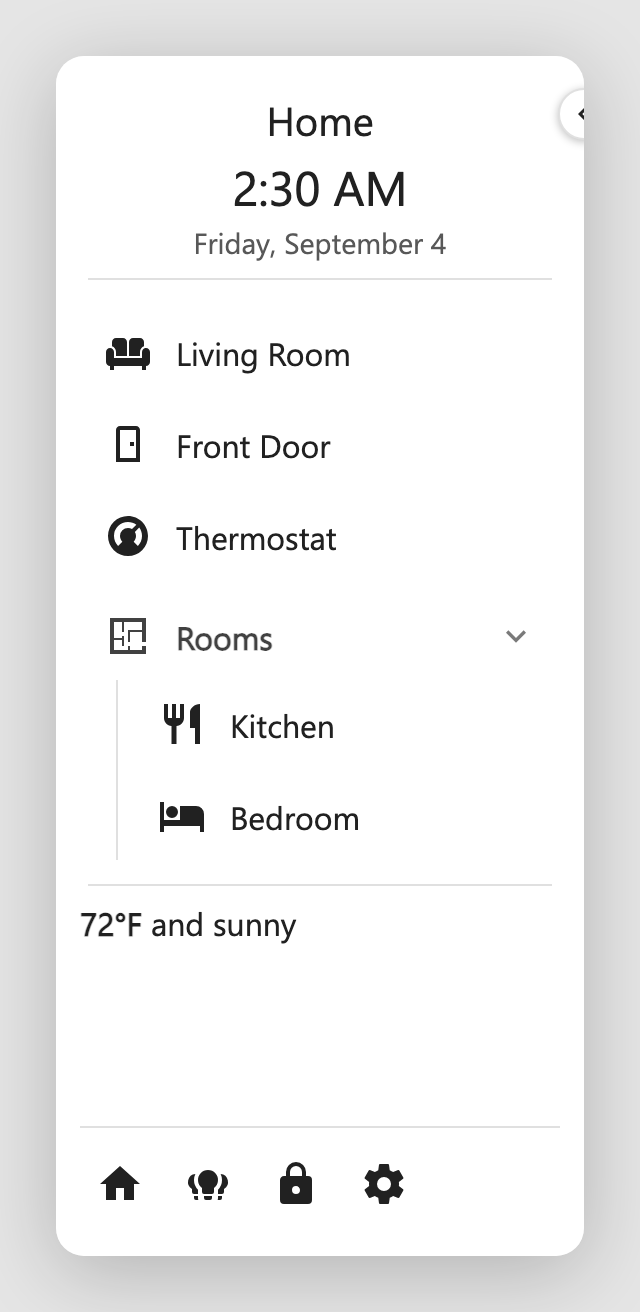
A configurable sidebar for Home Assistant Lovelace dashboards. It docks to the
left or right of a dashboard view, pushes the view aside (rather than floating
over it), and is edited in place through a visual editor, with no YAML needed,
though everything it produces is plain YAML under a dashboard_sidebar key.
What it looks like

See it in action
The sidebar in the clip is styled with card-mod (gradient background, a gradient-fill title, and glows). Here is the exact config behind it:
The full dashboard_sidebar YAML behind this demo
dashboard_sidebar:
  position: left
  width: 240
  start_collapsed: false
  background: 'radial-gradient(120% 80% at 15% -10%, rgba(167,139,250,0.55) 0%, rgba(167,139,250,0) 58%), radial-gradient(90% 55% at 110% 105%, rgba(34,211,238,0.40) 0%, rgba(34,211,238,0) 55%), linear-gradient(165deg, #0a0f1f 0%, #141a35 48%, #1d1236 100%)'
  card_mod:
    style: |
      .dashboard-sidebar-root {
        border-right: 1px solid rgba(148,163,184,0.18);
        box-shadow: inset 0 0 70px rgba(124,58,237,0.28);
      }

      .dashboard-sidebar-category-header {
        text-transform: uppercase;
        letter-spacing: 0.12em;
        font-size: 0.72rem;
        opacity: 0.85;
      }
  header:
  - type: title
    text: MY HOME
    align: center
    text_color: '#e9d5ff'
    card_mod:
      style: |
        .dashboard-sidebar-title {
          background: linear-gradient(90deg,#a78bfa,#22d3ee,#f0abfc,#a78bfa);
          background-size: 300% auto;
          -webkit-background-clip: text;
          background-clip: text;
          color: transparent;
          letter-spacing: 0.20em;
        }
  - type: clock
    format: '%-I:%M %p'
    align: center
    text_color: '#7dd3fc'
    card_mod:
      style: |
        .dashboard-sidebar-clock {
          text-shadow: 0 0 18px rgba(125,211,252,0.55);
          font-weight: 400;
        }
  - type: date
    format: '%A, %B %-d'
    align: center
    text_color: '#94a3b8'
  - type: divider
    color: rgba(148,163,184,0.30)
  body:
  - type: item
    title: Overview
    icon: mdi:view-dashboard-variant
    icon_color: '#38bdf8'
    text_color: '#e2e8f0'
    tap_action:
      action: navigate
      navigation_path: /sidebar-test/home
  - type: item
    title: Devices
    icon: mdi:devices
    icon_color: '#facc15'
    text_color: '#e2e8f0'
    tap_action:
      action: navigate
      navigation_path: /sidebar-test/devices
  - type: category
    title: Rooms
    text_color: '#cbd5e1'
    icon: mdi:sofa
    icon_color: '#a78bfa'
    start_collapsed: false
    guide_line: true
    items:
    - title: Living Room
      text_color: '#e2e8f0'
      icon: mdi:television-classic
      icon_color: '#f0abfc'
      tap_action:
        action: navigate
        navigation_path: /sidebar-test/living-room
    - title: Kitchen
      text_color: '#e2e8f0'
      icon: mdi:silverware-fork-knife
      icon_color: '#fb7185'
      tap_action:
        action: navigate
        navigation_path: /sidebar-test/kitchen
    - title: Basement
      text_color: '#e2e8f0'
      icon: mdi:stairs-down
      icon_color: '#22d3ee'
      tap_action:
        action: navigate
        navigation_path: /sidebar-test/basement
  - type: category
    title: Garden
    text_color: '#cbd5e1'
    icon: mdi:sprout
    icon_color: '#4ade80'
    start_collapsed: true
    items:
    - title: Irrigation
      text_color: '#e2e8f0'
      icon: mdi:water
      icon_color: '#38bdf8'
      tap_action:
        action: navigate
        navigation_path: /sidebar-test/garden
    - title: Grow Lights
      text_color: '#e2e8f0'
      icon: mdi:lightbulb-on-outline
      icon_color: '#fde047'
      entity: light.grow_lights
      tap_action:
        action: toggle
  - type: markdown
    content: '**{{ states(''sensor.lights_on'') }}** lights on'
    align: center
  - type: divider
  - type: card
    align: center
    background: rgba(15,23,42,0.45)
    card:
      type: gauge
      entity: sensor.kitchen_minisplit_indoor_temperature
      name: Living Room
      min: 50
      max: 90
      severity:
        green: 62
        yellow: 76
        red: 84
      card_mod:
        style: |
          * {
            background: none!important;
          }
  footer:
    divider: true
    buttons:
    - icon: mdi:home
      icon_color: '#38bdf8'
      title: Home
      tap_action:
        action: navigate
        navigation_path: /sidebar-test/0
    - icon: mdi:lightbulb-group
      icon_color: '#fde047'
      title: All lights
      entity: light.all_lights
      tap_action:
        action: toggle
    - icon: mdi:thermostat
      icon_color: '#fb7185'
      title: Climate
      tap_action:
        action: navigate
        navigation_path: /sidebar-test/climate
    - icon: mdi:cog
      icon_color: '#94a3b8'
      title: Settings
      tap_action:
        action: navigate
        navigation_path: /config/dashboard
    - icon: mdi:abacus
      tap_action:
        action: none
      icon_color: aqua
These docs show every task two ways
Each how-to has a Visual editor tab and a YAML tab. Pick one with the toggle on any example and the whole site follows you, on every page.
Highlights
- 🧩 Three regions: a header pinned to the top, a body that scrolls, and a footer pinned to the bottom.
- 🧱 Plenty to fill them with: titles, clocks, dates, dividers, tappable items, collapsible categories, Markdown blocks (markdown plus Jinja), and Cards, meaning any Lovelace card at all.
- ↔️ Collapses to an icon strip: one toggle on the edge and the whole thing narrows. Items keep hover tooltips, categories pop out their children.
- 👆 Tap, hold, and double tap: toggle, more-info, navigate, url, or call-service, each gesture with its own target. Navigation links highlight the page you're on and follow you as you move.
- 🪄 Jinja where it counts: text, icons, and color fields all template, so a lock icon can go red when it's unlocked. Markdown blocks get markdown and Jinja both.
- 📐 Docks where you want it: left or right, any width, pushing the view over or floating on top of it.
- 🎨 Wears your theme: colors, corners, shadows, and type follow the active Home Assistant theme, reading the same variables as HA's own nav sidebar.
- 🖌️ Styleable down to the pixel: per-element colors, any CSS background including gradients, and card-mod at both the whole sidebar and per-element level.
- 🖱️ Built by clicking, not typing: a five-tab editor (Settings, Header, Body, Footer, Mobile Bar, each named for the config key it edits) with a live preview that mirrors the real sidebar, drag-to-reorder, and a YAML escape hatch on every tab and element.
Requirements
- Home Assistant 2024.1 or newer.
- A Lovelace dashboard you can edit (any dashboard type). The sidebar is configured per dashboard.
- HACS to download the card. HACS is a separate, one-time add-on; if you do not have it yet, install it first (or add the card as a manual resource). See Install & Add.
- card-mod is optional, only needed for the advanced CSS styling in Styling. Everything else works without it.
At a glance
dashboard_sidebar:
  position: left
  header:
    - type: clock
      align: center
    - type: date
      align: center
    - type: title
      text: Hello Sam
      align: center
  body:
    - type: item
      title: Home
      icon: mdi:home
      tap_action:
        action: navigate
        navigation_path: /lovelace/home
  footer:
    buttons:
      - icon: mdi:lightbulb
        entity: light.kitchen
        tap_action:
          action: toggle
Head to Install & Add to get it onto a dashboard.