Mobile Bar
On narrow screens the sidebar can be replaced by a bar pinned to the bottom (or top) of the screen. Elements that don't fit fold into a ⋯ sheet that slides up, along with the footer and any extra entries you curate.
The bar only exists when on_mobile is bar. Adding a mobile: section turns
it on by default; see Sidebar Settings for on_mobile,
on_desktop, and the breakpoint that decides what counts as narrow.
Two modes
The bar gets its content one of two ways, chosen by mode:
| Mode | What the bar shows |
|---|---|
mirror (default) |
The desktop nav, in document order, and the desktop footer. |
custom |
Only what you spell out under mobile. It inherits nothing. |
Open the Mobile Bar tab. The ⋯ menu switches between Mirror Desktop and Custom Bar. Switching to custom asks whether to Copy Desktop Bar (clone what the mirror shows, footer included) or Start Empty.
Mirror mode shows the bar's options as a form. Custom mode is edited as YAML, with a collapsed Mobile YAML reference above the editor listing every key and linking here.
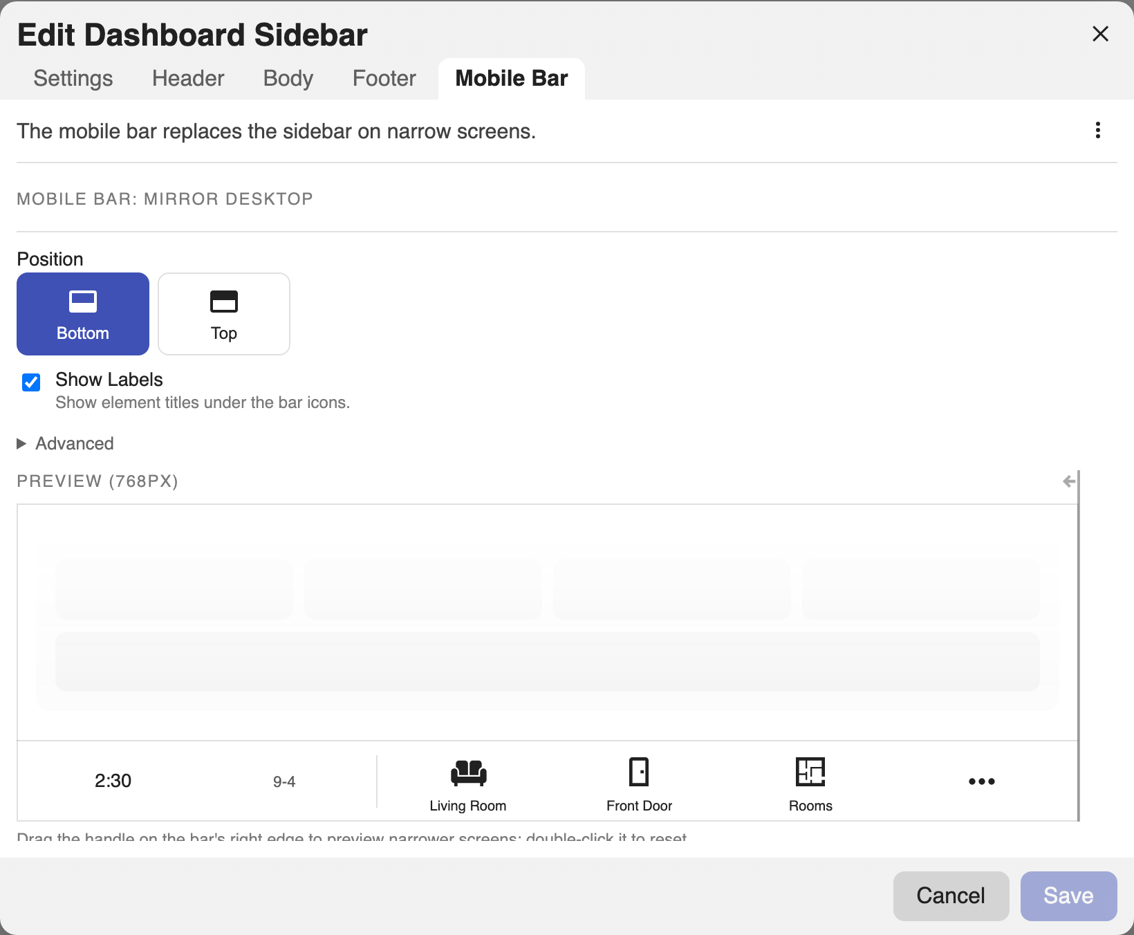
mobile:
  mode: mirror        # mirror | custom; default mirror
  position: bottom    # top | bottom; default bottom
  labels: false       # show element titles under the bar icons
items, menu, and footer belong to custom mode. Setting any of them
without mode: custom is an error rather than a silent no-op, because a
mirrored bar follows the desktop and carries nothing of its own.
Mirror mode
The default. The bar shows the items, categories, dividers, clocks, and dates
from the desktop header and body, in order, and the desktop footer rides
behind the ⋯ sheet. Nothing else is configurable per element: change the
desktop and the bar follows.
Only the presentation options apply here.
mobile:
  position: bottom
  labels: true
  background: 'linear-gradient(180deg, #1b2735, #090a0f)'
Custom mode
The mobile section becomes the whole bar. Nothing is inherited, which is why
Copy Desktop Bar exists: it seeds items and footer from what the mirror
would have shown, so the switch is lossless.
Custom mode is YAML-only. The preview beside it is live but read-only: tapping the ⋯ slot still opens the sheet so you can see the folded entries, but elements are not selected or dragged there.
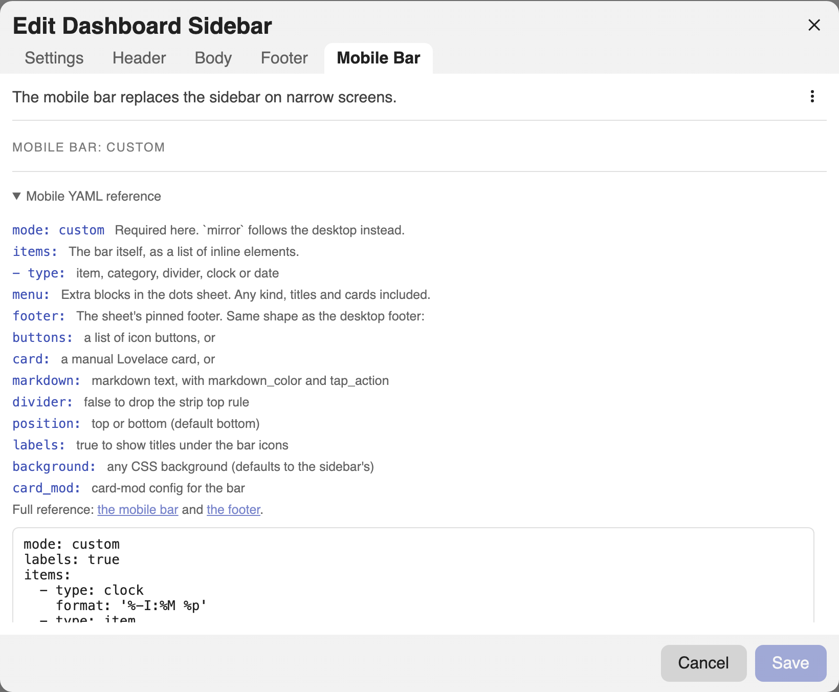
mobile:
  mode: custom
  labels: true
  items:                      # the bar itself, in order
    - type: clock
    - type: item
      title: Overview
      icon: mdi:view-dashboard
      tap_action:
        action: navigate
        navigation_path: /lovelace/0
    - type: category           # categories open a flyout above their slot
      title: Rooms
      icon: mdi:sofa
      items:
        - title: Kitchen
          icon: mdi:silverware-fork-knife
          tap_action:
            action: navigate
            navigation_path: /lovelace/kitchen
  menu:                        # extra entries inside the ⋯ sheet
    - type: title
      text: Elsewhere
    - type: markdown
      content: '**{{ states("sensor.power") }} W** right now'
  footer:                      # the sheet's pinned footer
    buttons:
      - icon: mdi:lock
        tap_action:
          action: toggle
          entity: lock.front_door
items accepts item, category, divider, clock, and date. Leave it
out entirely for a bar that lives only behind the ⋯ sheet.
menu accepts any block kind, including titles, markdown, and cards, and
renders inside the sheet between the folded slots and the footer.
The sheet footer
mobile.footer takes the same shape as the desktop footer: a
button strip, a card, or markdown, with the same divider and markdown
options.
mobile:
  mode: custom
  footer:
    divider: true
    buttons:
      - icon: mdi:cog
        tap_action:
          action: navigate
          navigation_path: /config/dashboard
    # or card: { type: entities, entities: [light.kitchen] }
    # or markdown: '**Good evening**'
In mirror mode the desktop footer is used and mobile.footer is rejected. In
custom mode the bar has no footer at all unless you set this, since a custom
bar inherits nothing.
Options
mobile:
  position: bottom     # top | bottom; which edge the bar docks to
  labels: false        # show element titles under the bar icons
  background: ''       # any CSS background; defaults to the sidebar's
  card_mod: {}         # card-mod config for the bar itself
These apply in both modes. Every part of the bar carries a
dashboard-sidebar-bar-* class for card-mod targeting,
and elements keep their own class and id hooks.
The full field list is in the config reference.