Footer
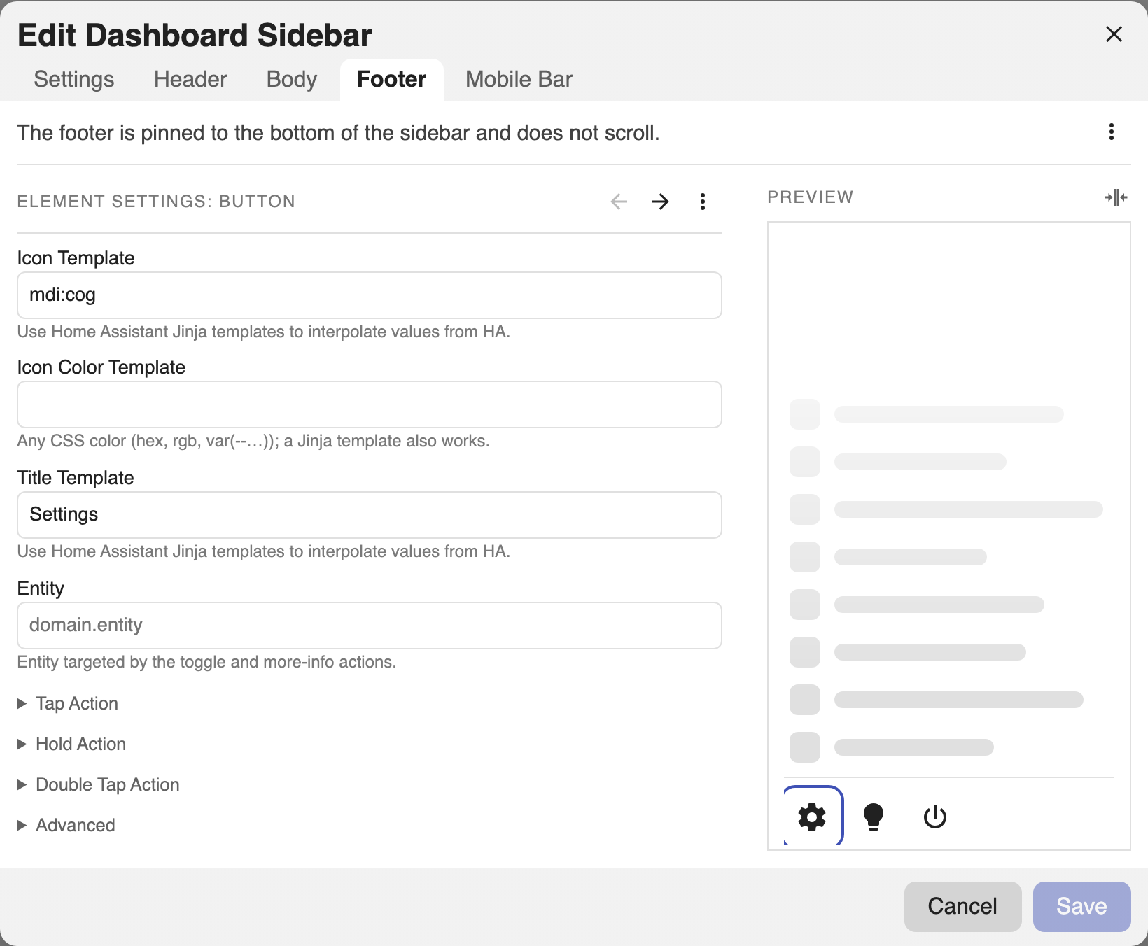
The footer is pinned to the bottom of the sidebar and never scrolls. It has exactly one of three modes (a Button Row, a Card, or a Markdown block) plus an optional top divider bar.
Switch modes in the editor's Footer tab via the ⋯ menu → Change to. The ⋯ menu also toggles the top divider and flips this tab between UI and YAML editing.
The mode is chosen by which key you set under footer: buttons, card, or
markdown. Set divider: false to hide the top divider bar.
Button Row
A row of icon buttons. When they don't all fit, the overflow collapses into a vertical ⋯ menu (in both expanded and collapsed views).
In the Footer tab (Button Row mode), press + to add a button. Each button takes an Icon, an optional Entity, a Title (tooltip), and its own Tap/Hold/Double Tap actions. Icon Color and Card Mod live under Advanced. Drag to reorder.
footer:
  divider: true          # show the top divider bar; default true
  buttons:
    - icon: mdi:lightbulb
      icon_color: '{{ "#ffb74d" if is_state("light.kitchen","on") else "grey" }}'
      title: Kitchen      # tooltip / accessible label; templatable
      entity: light.kitchen
      tap_action:
        action: toggle
    - icon: mdi:cog
      tap_action:
        action: navigate
        navigation_path: /config/dashboard
Each button supports the same actions, an icon_color template,
and an Advanced section (card_mod). Collapsed, the whole row becomes a
single ⋯ menu.
Card
Any Lovelace card, full width.
In the Footer tab, use ⋯ → Change to → Card, then paste any Lovelace card config.
footer:
  divider: true
  card:
    type: entities
    entities:
      - light.kitchen
Markdown
Markdown with Jinja.
In the Footer tab, use ⋯ → Change to → Markdown, then write the markdown. A Text Color and Tap/Hold/Double Tap actions are available so the footer can act as a link or toggle.
footer:
  divider: false
  markdown: '**{{ states("sensor.power") }} W** right now'
  markdown_color: var(--secondary-text-color)
  # tap_action / hold_action / double_tap_action also supported
The markdown footer can carry tap/hold/double-tap actions, so it can act as a link or toggle.