Sidebar Settings
Sidebar-wide options live on the top level of the dashboard_sidebar config, and
in the editor's Settings tab.
Two ways to edit, one switch
Every how-to on this site has a Visual editor tab and a YAML tab showing the same change two ways. Pick one and the whole site follows you, on every page, until you switch back.
For the complete list of every field, its type, and whether it is required, see the Config Reference (generated from the source, always current).
Sidebar-wide options
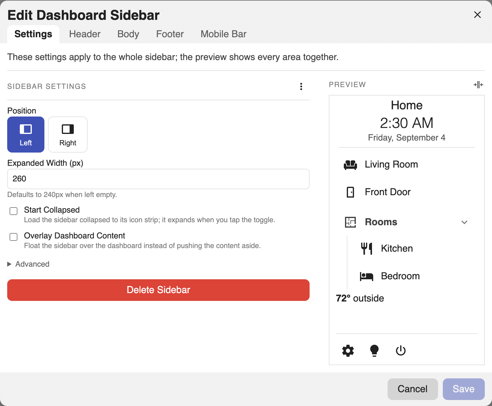
Open the editor and go to the Settings tab. The main options are laid out as fields:
- Position: which edge the sidebar docks to (left or right).
- Width: the expanded width in pixels. Defaults to 240 when left empty.
- Start Collapsed: load collapsed to the icon strip.
- Overlay Dashboard Content: float the sidebar over the dashboard instead of pushing the content aside.
Under Settings → Advanced:
- Mobile Breakpoint (px): the viewport width at and below which the mobile choices apply. Defaults to 768.
- On Desktop: whether the sidebar shows on wide screens, or nothing does.
- On Mobile: whether narrow screens get the sidebar, the mobile bar, or nothing.
- Background: any CSS background, including gradients.
- The whole-sidebar Card Mod.
dashboard_sidebar:
  position: right
  width: 300
  start_collapsed: false
  overlay: false
  on_desktop: sidebar
  on_mobile: bar
  breakpoint: 768
  background: linear-gradient(180deg, #1b2735, #090a0f)
  header: []
  body: []
  footer: {}
| Option | Type | Default | Description |
|---|---|---|---|
position |
left | right |
left |
Which edge the sidebar docks to. |
width |
number (px) | 240 |
Expanded width. |
start_collapsed |
boolean | false |
Load collapsed to the icon strip. |
overlay |
boolean | false |
Float over the dashboard instead of pushing the content aside. |
on_desktop |
sidebar | hidden |
sidebar |
What renders on wide (desktop) viewports. |
on_mobile |
sidebar | bar | hidden |
sidebar |
What renders on narrow (mobile) viewports. Defaults to bar when a mobile section exists. |
breakpoint |
number (px) | 768 |
Viewport width at and below which "mobile" applies. |
background |
CSS background |
theme card bg | Any CSS background, including gradients. |
header |
list | - | Blocks pinned to the top. |
body |
list | - | Blocks in the scrolling region. |
footer |
mapping | - | The bottom bar (see Footer). |
card_mod |
mapping | - | card-mod styling for the whole sidebar (see Styling). |
Push or overlay
By default the sidebar pushes: the dashboard view sits beside it and narrows
by the sidebar's width, so nothing is ever covered. Set overlay: true and the
sidebar floats over the view instead, which keeps the dashboard at full
width at the cost of hiding whatever is underneath the sidebar. Collapsing works
the same either way, so an overlay sidebar that starts collapsed covers only the
icon strip until you expand it.
dashboard_sidebar:
  overlay: true
  start_collapsed: true
An overlay sidebar draws a drop shadow so its edge reads against the content.
Restyle or remove it with --dashboard-sidebar-overlay-shadow (see
Styling).
Collapsing
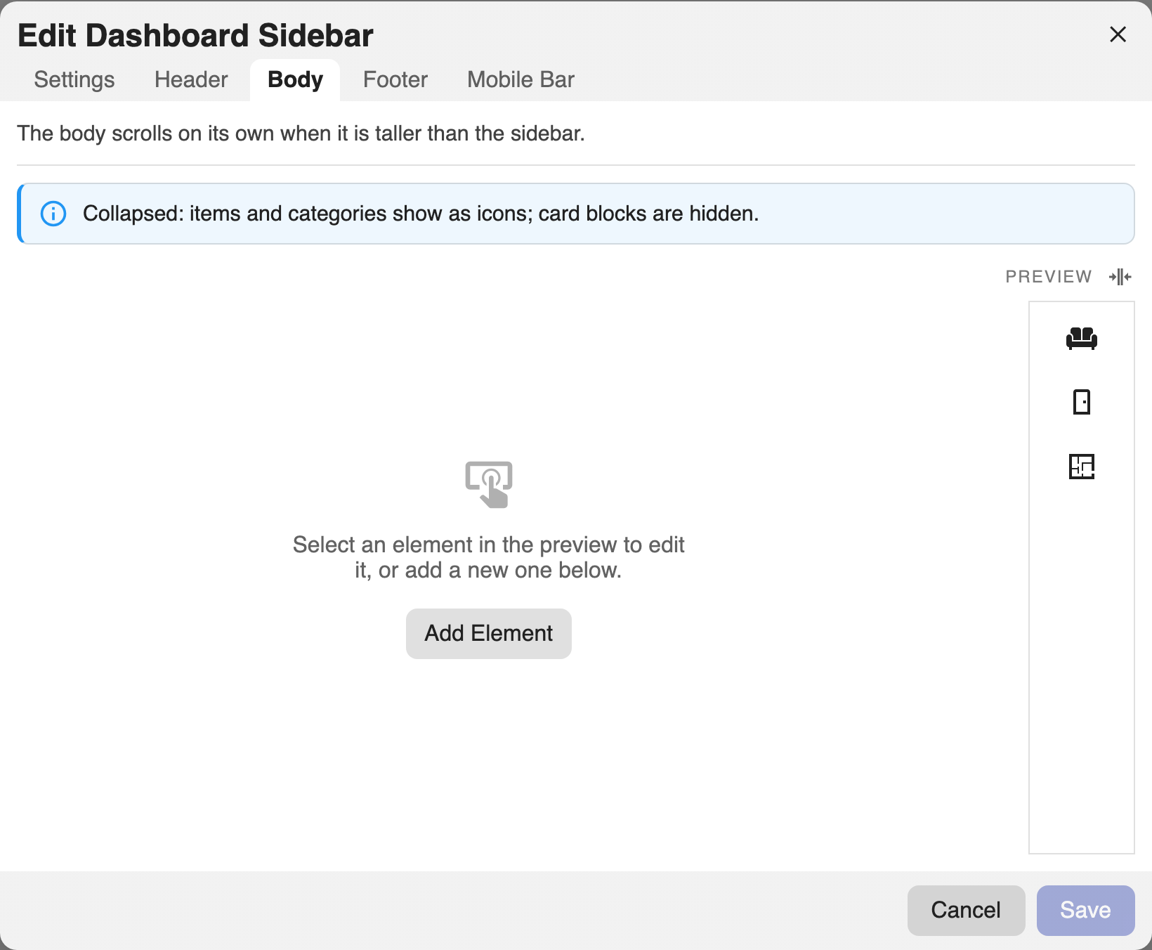
The sidebar can collapse to a slim icon strip using the toggle on its edge; the choice is remembered per browser. While collapsed:
- Titles and Text blocks are hidden.
- Items and categories show as icons (or their abbreviation when they have no icon); hovering shows a tooltip, and a category opens a popover of its items.
- Footer buttons collapse into a single ⋯ menu.
The editor's Preview has its own collapse toggle so you can check the icon strip while building:
Regions
- Header: pinned to the top, never scrolls.
- Body: scrolls on its own when taller than the sidebar.
- Footer: pinned to the bottom, never scrolls.
Each region holds an ordered list of elements.
The Header, Body, and Footer tabs each edit the config key they are named for. Add an element with the + button, drag to reorder, and select any element to edit it.
dashboard_sidebar:
  header:
    - type: title
      text: Home
  body:
    - type: item
      title: Living Room
      tap_action: { action: navigate, navigation_path: /lovelace/living }
  footer:
    buttons:
      - icon: mdi:cog
        tap_action: { action: navigate, navigation_path: /config }